Best 7 React UI Libraries for 2024
Discover the top React UI libraries for 2024. From Material-UI to Chakra UI, explore the best libraries to enhance your web development workflow with customizable, accessible, and performant components. Stay ahead with the latest in React UI tools.

Hey there, fellow developers! 🌟 If you're diving into the world of web development, you know how crucial it is to have the right tools at your disposal. React, one of the most popular JavaScript libraries for building user interfaces, offers a ton of UI libraries to make your life easier. Whether you're crafting simple apps or complex, data-heavy interfaces, picking the right UI library can make a world of difference. In this post, we'll explore the best React UI libraries for 2024, showcasing their features, use cases, and what makes them stand out. Ready to level up your projects? Let’s get started!
Table of Contents
Why Use React Component Libraries?
Using React component libraries is like having a toolbox filled with ready-to-use tools. Here’s why they’re awesome:
- Efficiency: Pre-built components save you a ton of time. Instead of building everything from scratch, you can plug in components and focus on what makes your app unique.
- Consistency: Libraries ensure your app looks and feels cohesive. They follow design principles and UI patterns that keep everything uniform.
- Customization: Many libraries are highly customizable, letting you tweak components to match your project’s design perfectly.
- Community Support: Popular libraries often have large, active communities. This means plenty of resources, tutorials, and help when you need it.
- Performance: Optimized components can significantly boost your app's performance, especially when dealing with complex UIs.
- Accessibility: Many libraries prioritize accessibility, ensuring that your app is usable by everyone, regardless of their abilities.
Considerations When Choosing a Library
Before you pick a library, consider these factors:
- Customization: How easy is it to tailor the components to fit your needs?
- Community and Support: Is there an active community and good documentation?
- Performance: Does the library affect your app’s performance, especially with large datasets?
- Compatibility: Will the library work with your current React version and other tools?
- Accessibility: Does the library support accessibility standards?
- Update Frequency: Is the library actively maintained and regularly updated?
1. Material-UI (MUI)
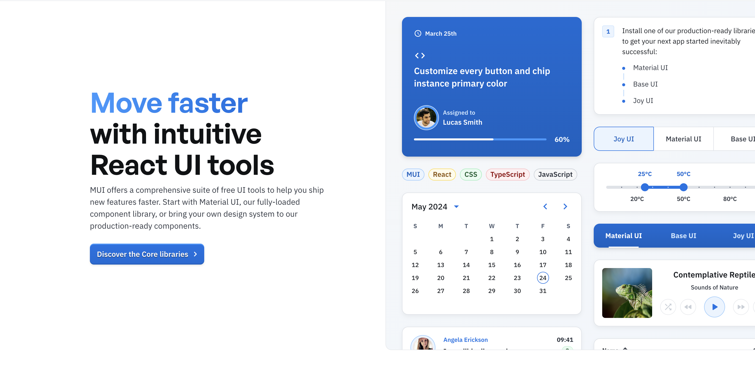
Material-UI is a powerhouse in the React world, known for its implementation of Google’s Material Design. It’s packed with components like buttons, forms, tables, and charts.
-
Features:
- Pre-built Components: Get started quickly with a wide range of ready-to-use components.
- Accessibility: High standards ensure your app is usable by everyone.
- Customization: Extensive theming support to make your app look exactly how you want.
- Community Support: A large, active community with tons of resources and comprehensive documentation.
-
Use Cases: Perfect for creating visually appealing and consistent applications, whether it’s a simple website or a complex enterprise solution.
-
Official Website: Material-UI
2. Ant Design
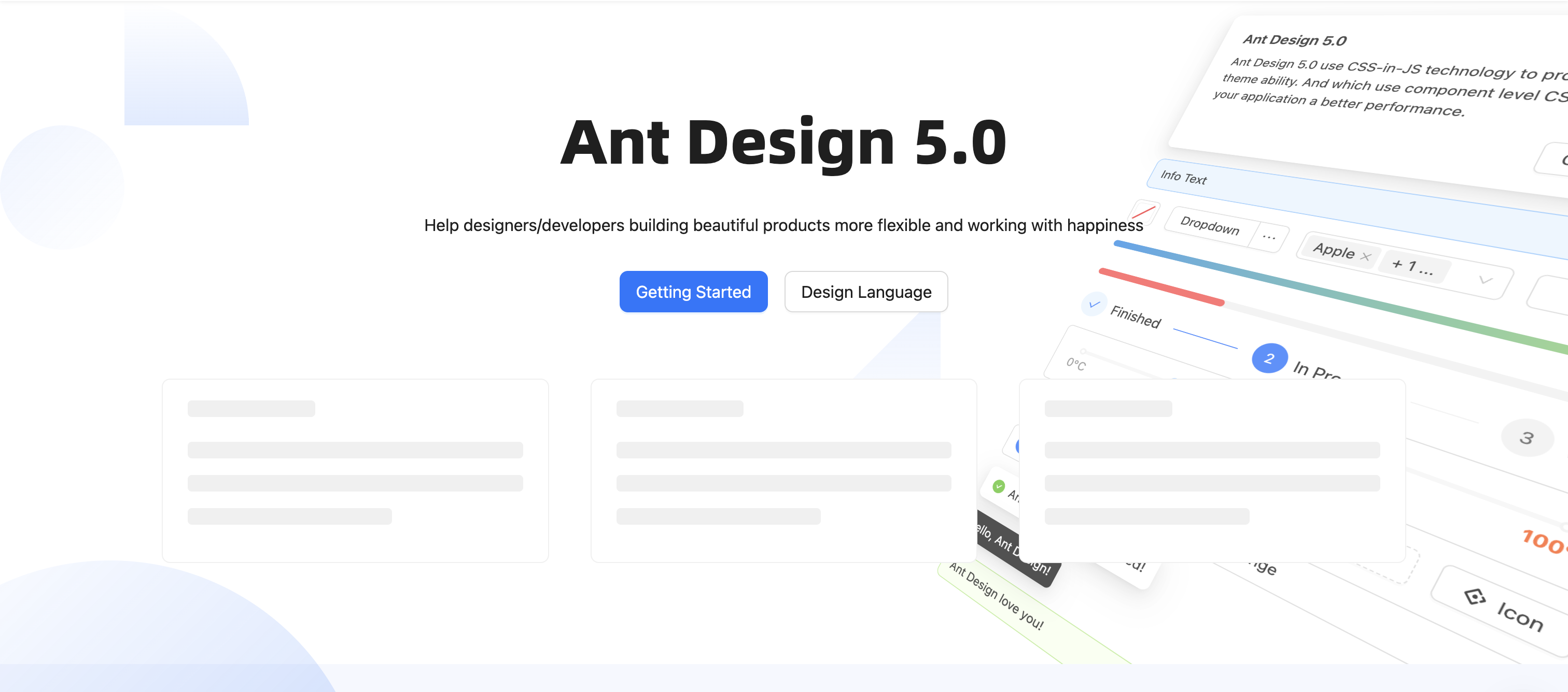
Ant Design stands out with its professional design and robust enterprise-level components. It’s heavily influenced by Chinese design principles, which gives it a unique edge.
-
Features:
- Enterprise-level Components: Includes everything from data tables to form layouts.
- Customization: Easily customizable themes with CSS-in-JS.
- Internationalization: Built-in support for multiple languages.
- Performance: Highly optimized for fast and efficient applications.
-
Use Cases: Ideal for enterprise applications that need to handle complex data management and require a polished, professional look.
-
Official Website: Ant Design
3. Chakra UI
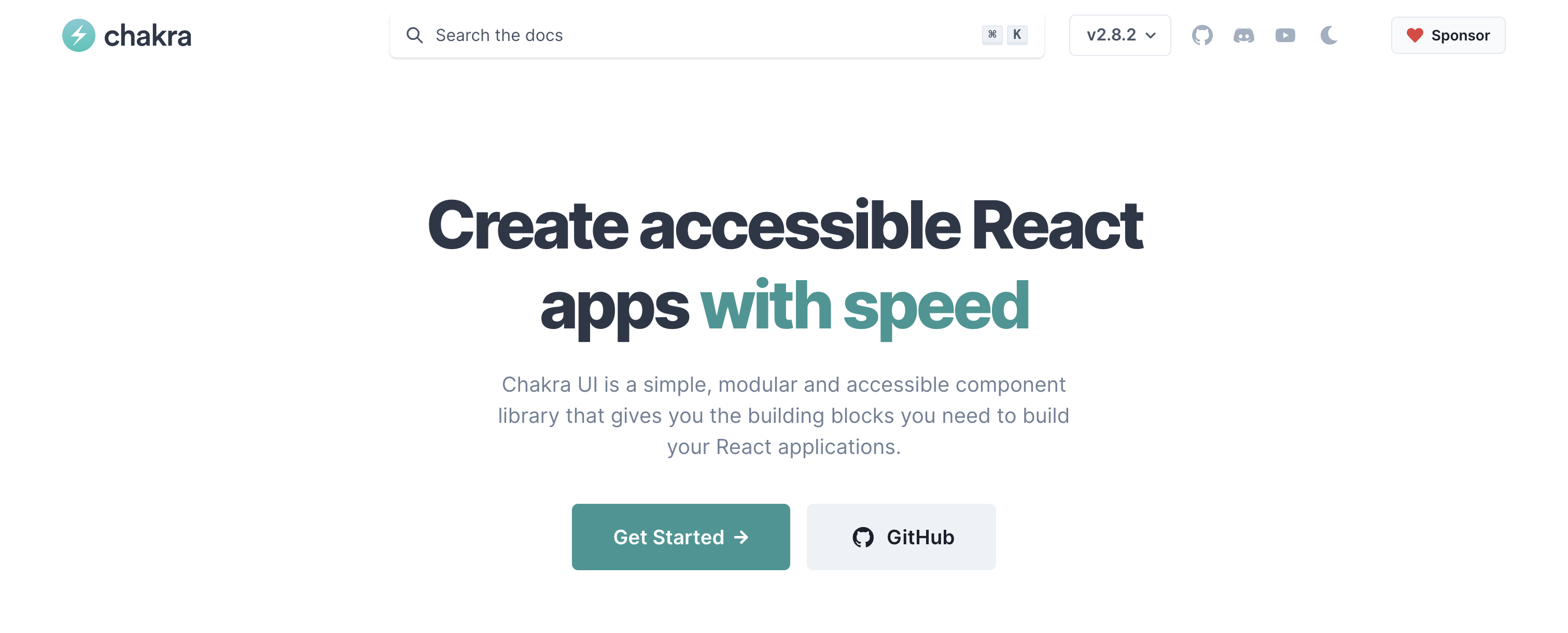
Chakra UI is all about simplicity, modularity, and accessibility. It’s designed to be highly composable, making it easy to use and style.
-
Features:
- Modular Architecture: Import only the components you need to keep your app lightweight.
- Theming and Styling: Easily match your design needs with comprehensive theming options.
- Accessibility: Built-in features ensure your UI is usable by everyone.
- Community Support: Strong support from a dedicated community.
-
Use Cases: Great for developers who prioritize inclusivity and flexibility in their web applications.
-
Official Website: Chakra UI
4. React Bootstrap
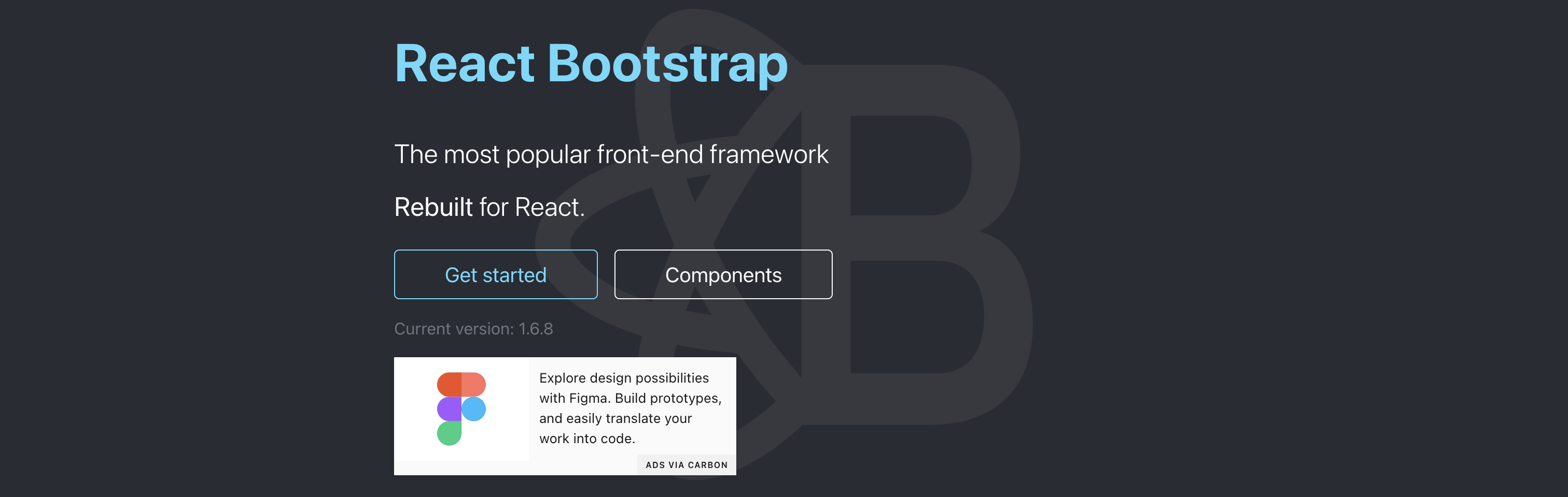
React Bootstrap combines the simplicity of Bootstrap with the power of React. It provides a responsive grid system and a wide range of pre-built components.
-
Features:
- Integration: Seamlessly integrates with React and Bootstrap.
- Responsive Design: Fully responsive components built with Flexbox.
- Customization: Customizable components to suit your design needs.
- Documentation: Extensive documentation and community resources for support.
-
Use Cases: Perfect for projects that need a quick start with a reliable, responsive design framework.
-
Official Website: React Bootstrap
5. Tailwind UI
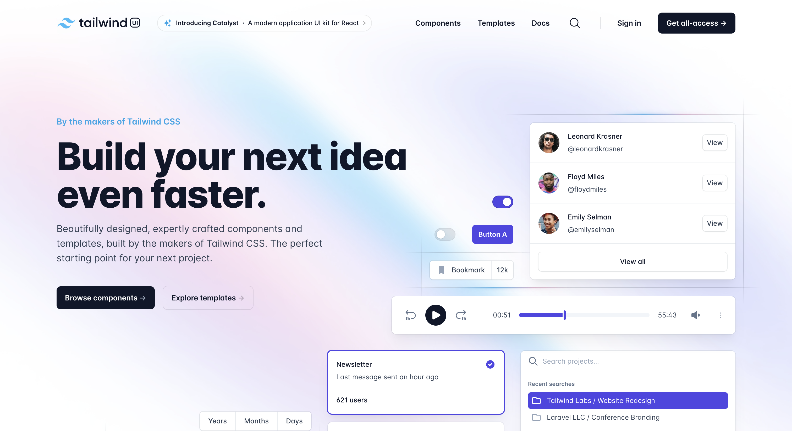
Tailwind UI, built on top of Tailwind CSS, offers beautifully designed, fully responsive UI components and templates that you can use in your React projects.
-
Features:
- Customizable Components: Fully customizable components and templates.
- Utility-First Approach: Built with utility-first Tailwind CSS for rapid styling.
- Component Library: Extensive component library with real-world examples.
- Accessibility: Responsive and accessible by default.
-
Use Cases: Ideal for developers who want to quickly build custom-styled user interfaces without writing extensive custom CSS.
-
Official Website: Tailwind UI
6. Semantic UI React

Semantic UI React brings the power of the Semantic UI framework to React, offering a declarative API and human-friendly HTML.
-
Features:
- Declarative API: Enables clean, readable code.
- Pre-built Components: Wide range of pre-built components.
- Shorthand Props: Allows for concise and efficient component customization.
- Integration: Seamless integration with other React libraries.
-
Use Cases: Perfect for developers who prefer a semantic approach to HTML and clean code structure.
-
Official Website: Semantic UI
7. Blueprint
Blueprint is designed for building complex, data-heavy applications, with a particular focus on desktop interfaces.
-
Features:
- Data Visualization: Extensive library of components for data visualization and manipulation.
- Desktop Focus: Primarily designed for desktop applications but also responsive.
- Styling Options: Comprehensive theming and styling options.
- TypeScript Support: Excellent TypeScript support for type-safe coding.
-
Use Cases: Best for applications requiring sophisticated data interaction and visualization, especially desktop-focused apps.
-
Official Website: Blueprint
FAQs
1. What are the key factors to consider when choosing a React UI library?
When selecting a React UI library, think about customization options, community support, documentation quality, performance, and compatibility with other tools and frameworks you’re using.
2. Which React UI library is best for enterprise-level applications?
Ant Design and Blueprint are great choices for enterprise-level applications due to their robust components, customization capabilities, and professional design aesthetics.
3. How do I ensure the accessibility of my UI components?
Choose libraries like Material-UI, Chakra UI, and Semantic UI React, which prioritize accessibility and provide components that meet accessibility standards out-of-the-box.
4. Can I use multiple React UI libraries in one project?
Yes, you can use multiple React UI libraries in a single project. Just make sure they don’t conflict with each other and that your app’s performance remains optimal.
5. How frequently are these libraries updated?
Most popular React UI libraries are actively maintained and regularly updated. Checking their GitHub repositories for the latest commits and release notes can provide insights into their update frequency.
By addressing these common questions and offering detailed information on each library, this post aims to help developers make informed decisions and enhance their projects' user interfaces effectively.
Happy Coding! 😊